UX Case Studies
TPASS
Making a travel pass easier to understand, use and explore.
The goal
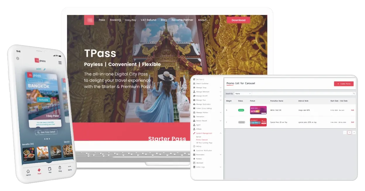
Help international visitors understand and use a single pass for attractions and restaurants in Thailand, with a back office for staff to manage the service.
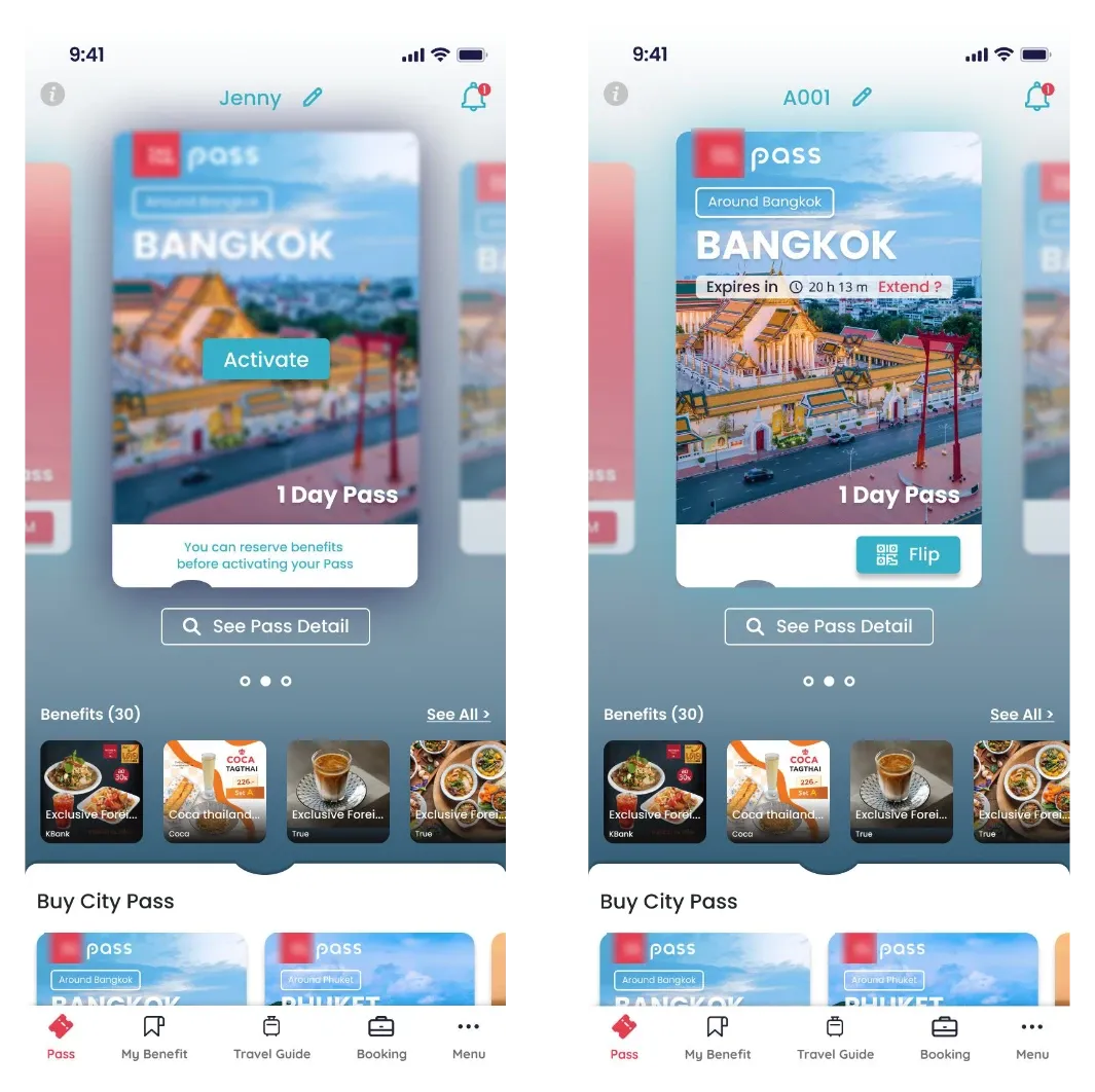
One pass, one card
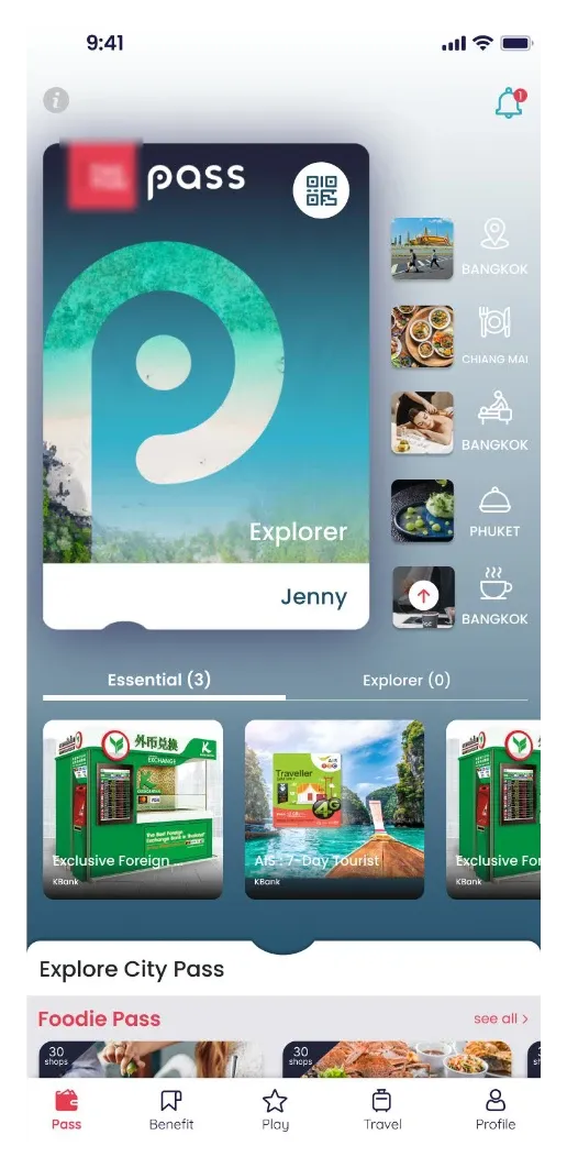
Usability testing revealed that people struggled to recognize the small images and white icons as other passes they had purchased. The original concept treated purchases as privileges or stamps added to one card.
Redesigned the interface so each pass appears as a separate card, matching the familiar idea of one ticket per card. The decision draws on real-world conventions, visible system status and consistency.
Start with the places people want to visit
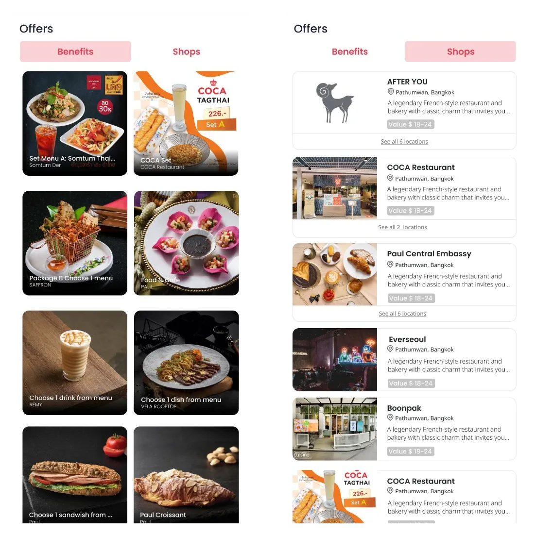
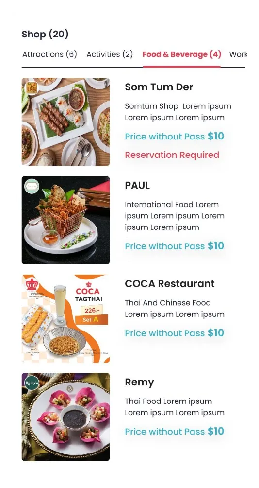
The benefits list was long and scattered. A separate shops view mixed storefront photos and logos, without clearly showing what each place offered.
Restructured the information architecture around categorized shops so people can focus on relevant benefits. Worked with the operations team to replace inconsistent images with pictures that communicate the experience, such as Thai food or a museum.